BinaryUIv1.0
Alerts
Alerts component provides important message to attract users attention without any interrupting.
Example of Alerts
Alerts are available in four types i.e Primary Alert, Successful Alert, Danger Alert and Warning Alert. To use this component, you have to add alert, according to your need you can use these classes primary-alert, successfull-alert, danger-alert, warning-alert.
Avatar
Avatar use for Profile picture, You can put your Image into avatar component.
Example of Image Avatar
Avatar are available in five different sizes. Extra large avatar, Large avatar, Medium avatar, Small avatar and Extra small avatar. Here, img-responsive applies responsive property to image and img-rounded applies 50% of border radius to avatar. You can use these according to your need avatar-ex-large, avatar-large, avatar-medium, avatar-small, avatar-ex-small
Example of Text Avatar
Even You can use Initial text as Avatar for users profile. By adding text-avatar
Badges
Badges are use for user status. (such as online and offline status). To show notification count user.
Example of Badge
Badges are available in four different types (status-online, status-offline, status-away and status-disturb) These are the classes you have to add. and also, You can use Badges on icon. You have to use these class as mentioned below.


Example of Text Badge
Even you can use Text Badge. We have text badge according to size heading h1 to h6, and also for Paragraph size p. Here, class text-h1 to text-h6 and text-p applies text sizes. And class badge, badge-h1 to badge-h6 and badge-p applies badge styling .
This is heading one Neog
This is heading two Neog
This is heading three Neog
This is heading four Neog
This is heading five Neog
This is heading six Neog
This is paragraph Neog
Cards
Card are use to show collective data which mean data that are related to one particular thing for example any product.
Example of text Cards
We have many cards such as Card with text, card with image, card with overlay and also we have some of cards for products.
Text card
This is card text
Lorem ipsum dolor sit amet consectetur adipisicing elit. Rerum, esse? Lorem ipsum dolor sit amet consectetur adipisicing elit. Consectetur, a?
Text card
This is subtitle
Lorem ipsum dolor sit amet consectetur adipisicing elit. Rerum, esse? Lorem ipsum dolor sit amet consectetur adipisicing elit. Consectetur, a?
Example of Vertical Cards
We have more than four vertical cards. You can use these cards for your website or personal projects with four different classes vertical-card, header-card, card-OFI(OFI- only footer icon), card-OFB(OFB- only footer button)

Our Changing Planet
by Kurt Wagner
Visit ten places on our planet that are undergoing the biggest changes today.

Our Changing Planet
by Kurt Wagner
Visit ten places on our planet that are undergoing the biggest changes today.

Our Changing Planet
by Kurt Wagner
Visit ten places on our planet that are undergoing the biggest changes today.

Our Changing Planet
by Kurt Wagner
Visit ten places on our planet that are undergoing the biggest changes today.
Example of Card with Text Overlay
We have also overlay Card with text. These two classes applies overlay styling to cards text-card-overlay and overlay-text
Our Changing Planet
by Kurt Wagner
Visit ten places on our planet that are undergoing the biggest changes today.
Text Overlay
Example of Card with Badge
We have Badge with vertical card. You can use this card for your products.

Premium Shirt
₹ 9999/-
Visit ten places on our planet that are undergoing the biggest changes today.
50% OFF
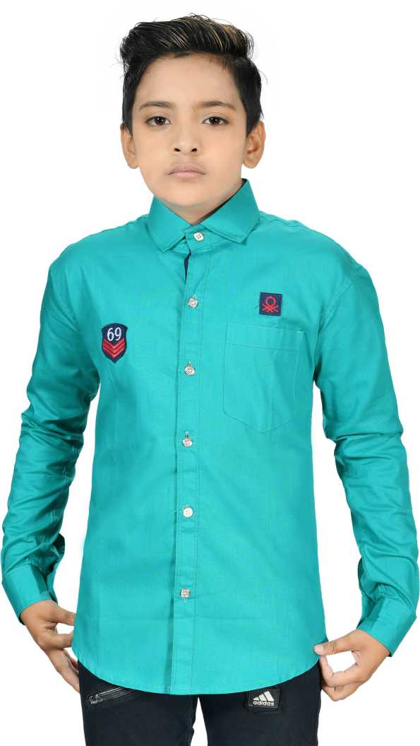
Example of Horizontal Card
Also we have Horizontal card for products which comes with two button. One button for Move to cart and other is for add to wishlist.
Premium Shirt
₹ 9999/-
Visit ten places on our planet that are undergoing the biggest changes today.
Example of Card shadow
Also we have vertical card for products with shadow. You have to add these class to get shadow on card. images-card and, shadow-card
Premium Shirt
₹ 9999/-
Visit ten places on our planet that are undergoing the biggest changes today.
Image
Image component can be responsive to their parent Element. (They never become wider than their parent.)
Example of Image
You have just add responsive-images to make image responsive. This class applies max-width: 100%; and height: auto; to the image so that it scales with the parent width.

Example of Rounded Image
You can make images rounded by adding this rounded-images class to img Element.

Inputs
Inputs are very Important part to take data from user using form element.
Example of Inputs
We have different types of input such as Primary input, Input with number, Input with error style. Here input class applies common styling to all input fields. Also we have a checkbox and radio inputs.
Example of Validation with signup
We have pre-build signup component. You can use this in your project to signup users.
Example of Validation with Login
Also, We have pre-build login component. You can use this in your project. Users can login to your website using it.
Text Utilities
Text Utilities is a important part for website. It use for Documentation your website.
Example of Headings
We have six different typography for Headings from text-h1 to text-h2, And one typography form Paragraph text-p
This is h1 Heading.
This is h2 Heading.
This is h3 Heading.
This is h4 Heading.
This is h5 Heading.
This is h6 Heading.
This is Paragraph
Example of Text alignment
Alignment use to align your text on web page. Right, Left, And Center. Here, You can use these classes to align text text-left, text-center, text-right
Example of Text Size
We have some default sizes for text. Such as Extra large text, Large text, Medium text, Small text, Extra small text. Here, You can use these classes to your need. text-xl, text-lg, text-md, text-sm, text-xm
Example of Text Transform
You can use these classes text-uppercase, text-lowercase, text-capitalize for text Uppercaase, Lowercase and Capitalize
Example of Text Color
We have some of text in different color for different use.
Lists
Lists can be use for so many things. Such as Listing some items, Stacked list, Space list, Navigation, etc. We have different types of list as mentioned below.
Example of Ordered Lists
Order list can be use for listing items but in specific order. To use this component you can add these classes according to your needs Even You can reverse the order of ordered list, add reversed attribute to ol element.
Example of Unordered List
We have also Unordered list. You can also list items using this. We mentioned some of list of types below.
Example of Stacked List (Notification Page)
Stacked list generally use for notification in you apps.

Tanay
Invitation: Chrome Dev Tools + How web works @ Sat 5 Feb 2022 7:30pm - 10:30pm
Tanay
Invitation: Chrome Dev Tools + How web works @ Sat 5 Feb 2022 7:30pm - 10:30pm
Tanay
Invitation: Chrome Dev Tools + How web works @ Sat 5 Feb 2022 7:30pm - 10:30pm
Tanay
Invitation: Chrome Dev Tools + How web works @ Sat 5 Feb 2022 7:30pm - 10:30pm
Tanay
Invitation: Chrome Dev Tools + How web works @ Sat 5 Feb 2022 7:30pm - 10:30pm
Example of Spaced List
It is similar as Stacked list But all list items not close to each other.
Tanay
Invitation: Chrome Dev Tools + How web works @ Sat 5 Feb 2022 7:30pm - 10:30pm
Tanay
Invitation: Chrome Dev Tools + How web works @ Sat 5 Feb 2022 7:30pm - 10:30pm
Tanay
Invitation: Chrome Dev Tools + How web works @ Sat 5 Feb 2022 7:30pm - 10:30pm
Tanay
Invitation: Chrome Dev Tools + How web works @ Sat 5 Feb 2022 7:30pm - 10:30pm
Tanay
Invitation: Chrome Dev Tools + How web works @ Sat 5 Feb 2022 7:30pm - 10:30pm
Toast
Toast can be use for show small amount of message. Such as feedback message.
Example of Toast
We have a basic toast example. You can see it by clicking on Live demo button.
JavaScript
Grid
We use grid system to helps align page elements based on sequenced columns and rows.
two items in a grid
We have (1x2) grid. To use this you have to add this class to grid-2-wrapper in parent container and child items should contain with this class grid-item.


three items in a grid
We have (1x3) grid. You can use to making card. To use this you have to add this class to grid-3-wrapper in parent container and child items should contain with this class grid-item.
Premium Shirt
₹ 9999/-
isit ten places on our planet that are undergoing the biggest changes today.
Premium Shirt
₹ 9999/-
isit ten places on our planet that are undergoing the biggest changes today.
Premium Shirt
₹ 9999/-
isit ten places on our planet that are undergoing the biggest changes today.